

Cow Pie Catapults Case Study
Overview
After the success of our previous collaboration, The Good Game company returned to us with an even bigger and more exciting challenge. Not only would we be designing and producing a promotional video for their latest gaming venture, Cow Pie Catapults, we were being given the opportunity to develop the branding for the entire game: from logo and character design, all the way through the packaging and game pieces themselves. Yessiree, the whole barnyard!
Initial Development
Logo Exploration
In this game, players use catapults to fling rubber poo across the game board in an attempt to knock over their opponent’s cows. Our first step was to create several black and white logo options. We really wanted to capture the playful absurdity of the game, while leaning into the barnyard setting.
Color Options
Once a black and white design was selected, we moved into fully developing the logo with color and texture options
Color Option 01

Color Option 02

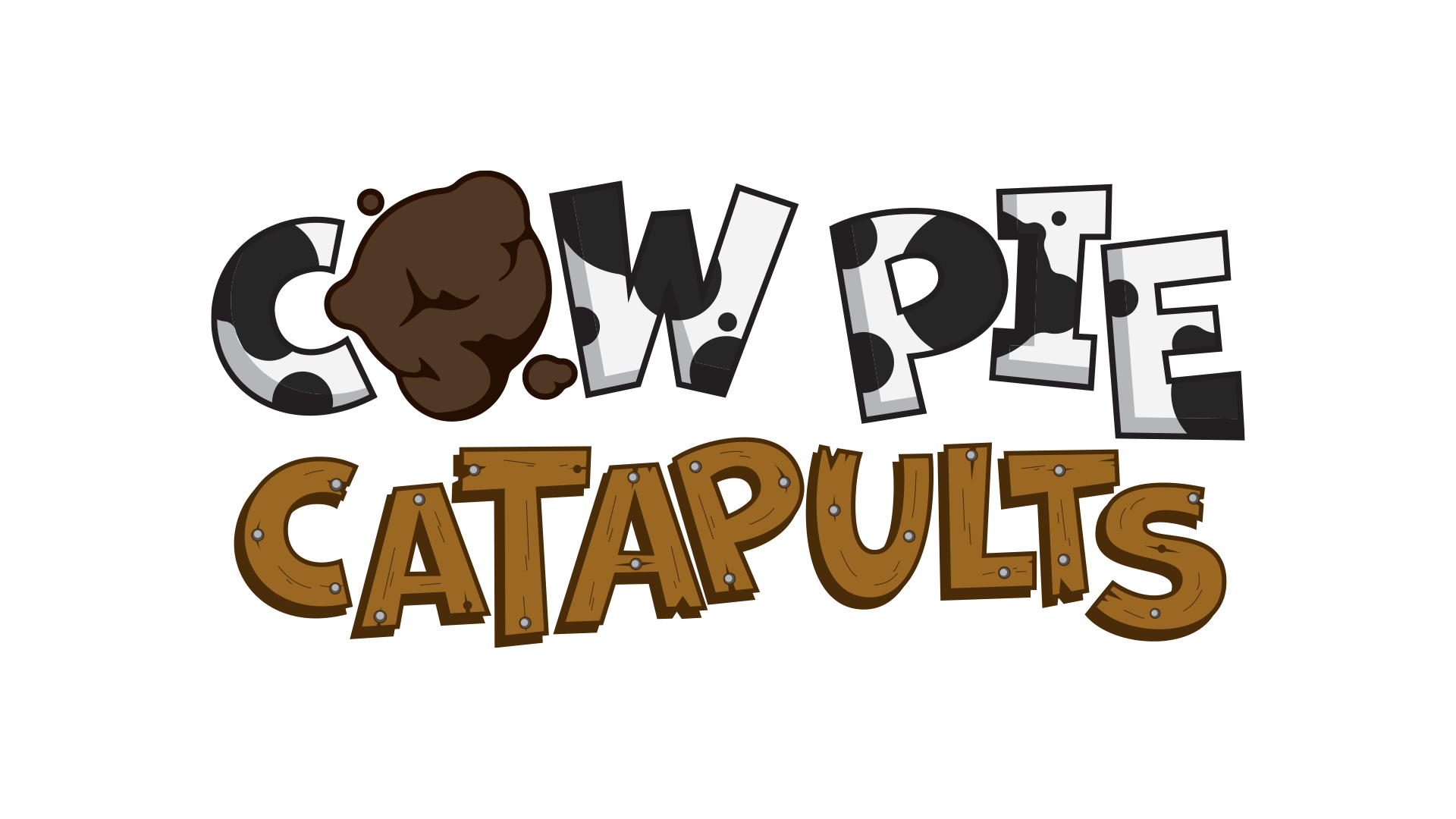
Final Logo Design
Character Design
We knew that the design of the characters was critical to the overall brand of the game. Not only would they be serving as game pieces, but they would inform the overall tone and aesthetic choices for the packaging and video to come. We explored many different ideas in both 2D and 3D.


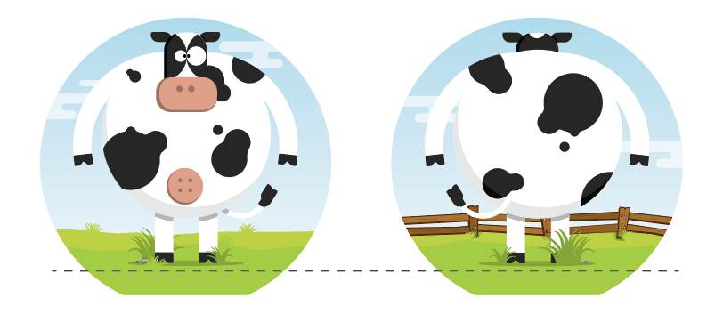
The selected character design was then tweaked and given a rear-facing view for use with the game piece design.

Game Piece Design
With the logo and character designs locked in, our next step was to start the illustration work on the actual game board and pieces.
Black & white cow game piece

Brown cow game piece

Game board

Catapult concept
Package Design
The design for the packaging underwent several iterations as the style of the physical packaging to be used was being developed.
We developed several digital sketches that ranged in design from a split cover with windows that revealed game pieces and would open like barn doors, to a bold look that would simply feature just our hero cow staring out from the shelf.

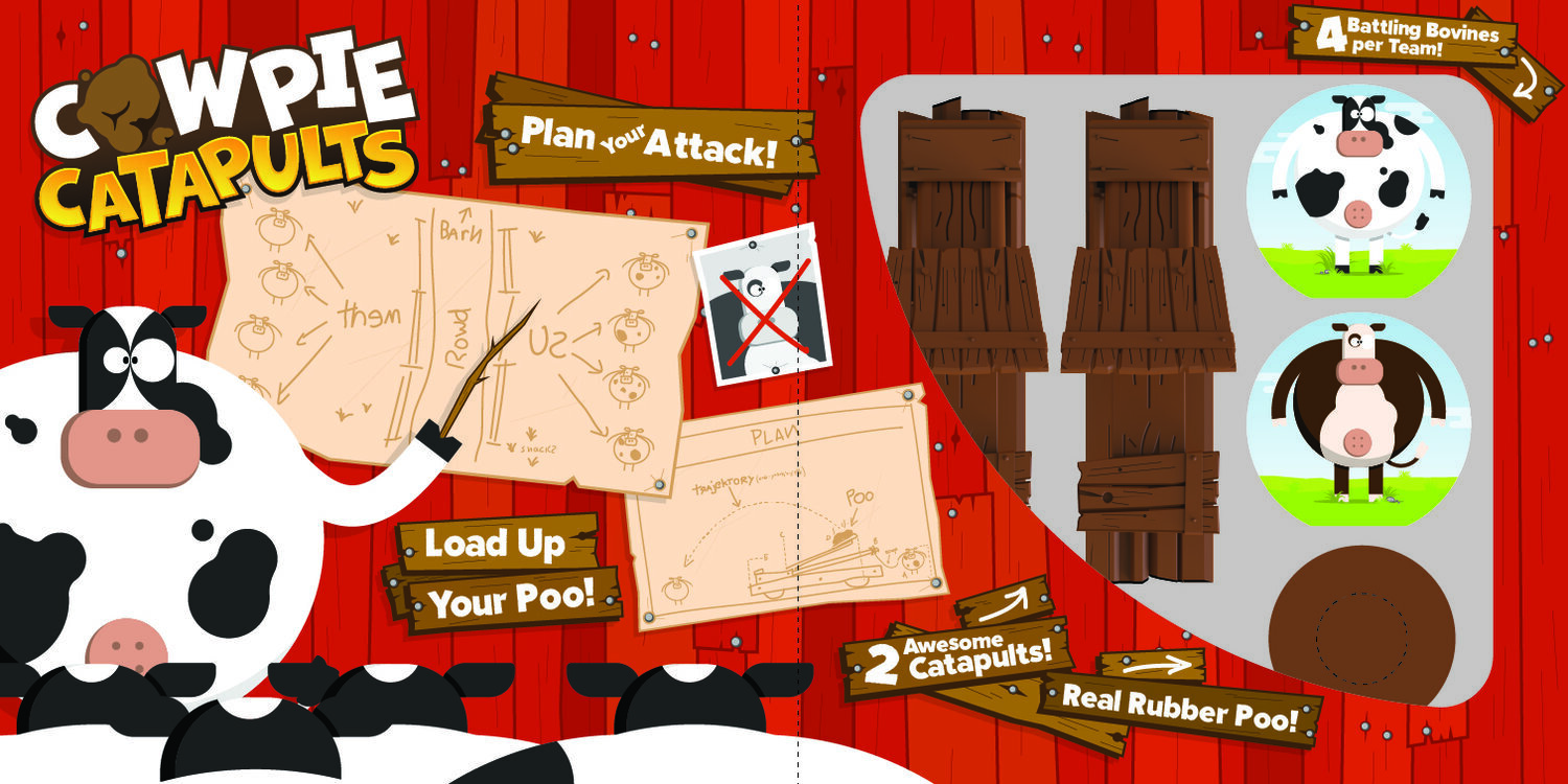
We landed on a design that featured our hero cow on a front flap that would open to reveal more art and game information, as well as a large window displaying all the game pieces.

Box front

Box back
Inside flap
In the end, due to packaging constraints, we lost the window and the inside flap became the cover art. Nevertheless, the final result is bright and bold and we couldn’t be happier with how it turned out.

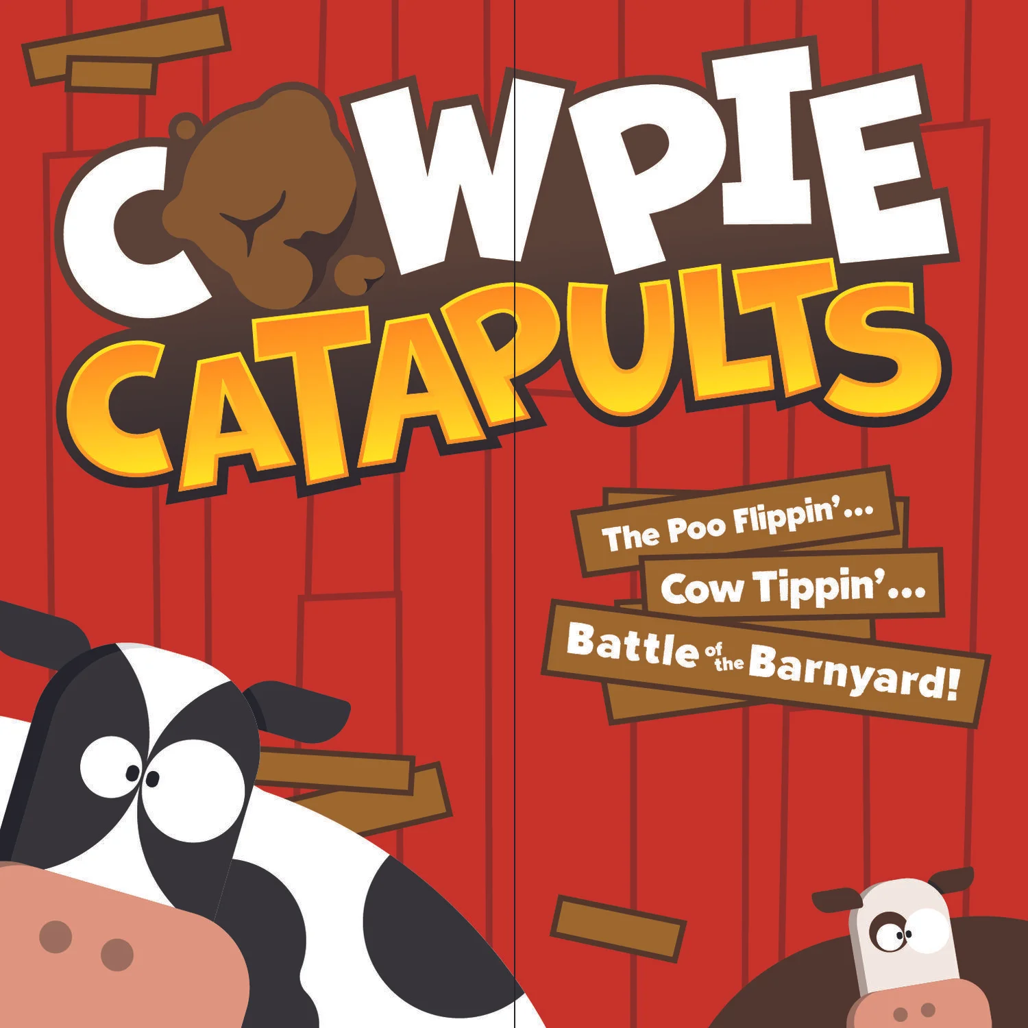
Final box art

Final game board and pieces with box
Promotional Video
Once the game itself moved into manufacturing and production, it was time to get started on a promotional video. We produced two different designs and a walk cycle to give the client an idea of the look and animation style. We ended up not needing the walk cycle, but it was still really fun to create.
Design 01


Design 02


Walk Cycle
Final Video
Design 02 was the obvious choice for the direction of the video as it tied directly to the package design. Here’s the final piece:
Conclusion
What an outstanding opportunity this was! Getting to develop a product starting from the ground floor was such great experience, and our client collaboration was at an all time high. We had an absolute blast working on it, and the results speak for themselves.